

Aerosphere
During my time at Aerosphere®, I played a key role in leading the company’s rebrand, helping modernize its visual identity and bring it into a new era. I worked across branding, apparel design, and website development to ensure a cohesive and refreshed look at every touchpoint. Seeing the updated identity come to life after months of collaboration and iteration was incredibly rewarding and solidified my passion for creating thoughtful, impactful brand systems.
-
Over the course of one year, the objective of the Aerosphere® rebrand was to modernize the company’s visual identity while establishing a comprehensive brand guideline system to support future partner collaborations. The project included designing a new logo, developing cohesive visual standards, and creating mockups for sales materials to ensure consistency, scalability, and a strong presence across all touchpoints.
-
The previous Aerosphere® branding was inconsistent and felt outdated. Without clear brand guidelines, materials varied in style and application, resulting in a fragmented identity that did not match the company’s growth or industry presence.
-
Solution:
Develop a modern, cohesive brand system that includes a redesigned logo, comprehensive brand guidelines for future partner collaborations, and polished sales and marketing materials to ensure consistency, credibility, and long-term scalability.Thesis:
To successfully reposition Aerosphere®, the brand needed a cohesive and modern identity system that reflected its innovation, strengthened credibility, and provided clear guidelines for consistent application across all platforms and future partnerships. -
The Aerosphere® rebrand was created for a B2B audience, including industry professionals and decision-makers in the aerospace and manufacturing sectors. The primary age range is 25–65. The updated identity needed to feel modern and refreshed while maintaining professionalism and credibility, positioning Aerosphere® as an innovative and reliable partner.
-
Deliverables
Full visual identity refresh
Redesigned website
Social media overhaul
Updated packaging and enclosure designs
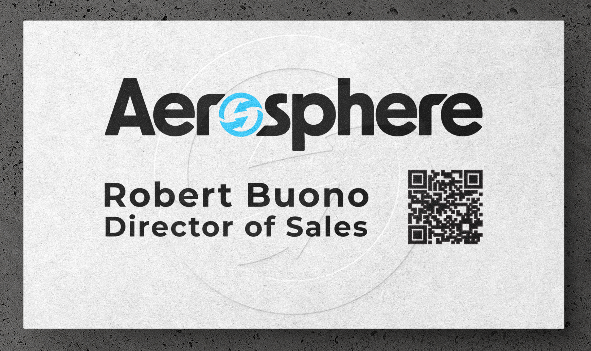
Sales materials
Business cards
Revised legal documentation
The Aerosphere® rebrand was designed to bring clarity, consistency, and a refreshed visual identity, ushering the brand into a new era. My goal was to unify the brand across all platforms and create a system that communicates reliability, innovation, and credibility to partners and clients.
Why Did We Need to Rebrand?
Formerly known as CO2 Monitoring, Aerosphere is recognized for its Aerosphere CO2 Monitoring System, alongside its end-to-end CO2 compliance solutions and services. The goal was to position the company as a modern, forward-facing brand that embodies innovation, adaptability, and long-term growth without losing the iconic symbol it has been known for.
Old Logo & Design Asset

The company was originally known as CO2 Monitoring but has since transitioned to doing business in the name Aerosphere. This change reflects a broader vision for the future, as leadership wanted a name that could grow alongside the company and support expansion beyond a single focus. Additionally, the Aerosphere name had already been referenced internally and externally, making it more recognizable and easier for audiences to remember.
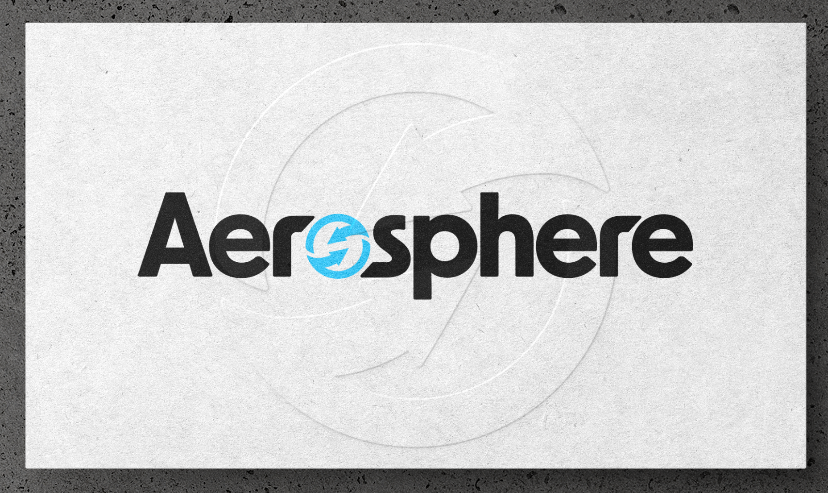
Along with the name change, the brand identity also received a visual refresh. The original logo was updated to feel more modern and adaptable, shifting toward a cleaner, more two-dimensional design. By simplifying the overall look and reducing complexity, the new logo becomes more dynamic and versatile across different formats.
This streamlined approach allows the brand to maintain clarity and impact, whether used in digital spaces, print, or large-scale applications.
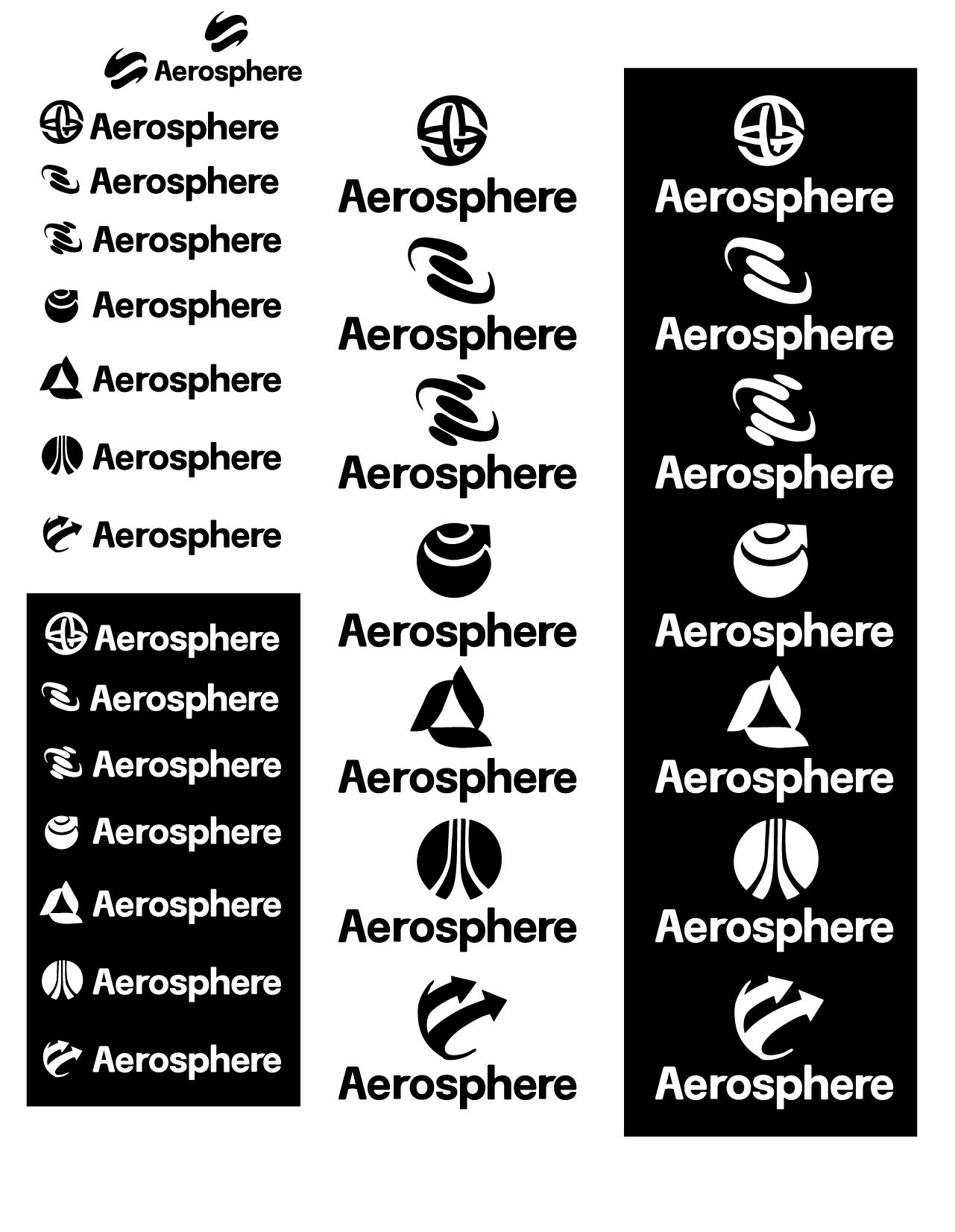
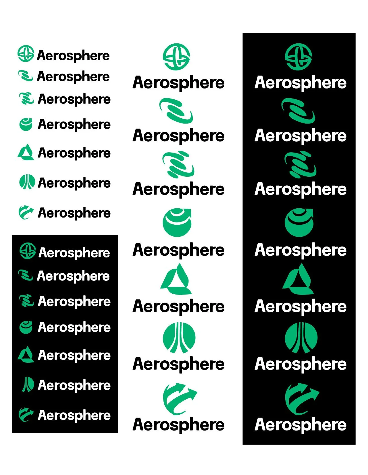
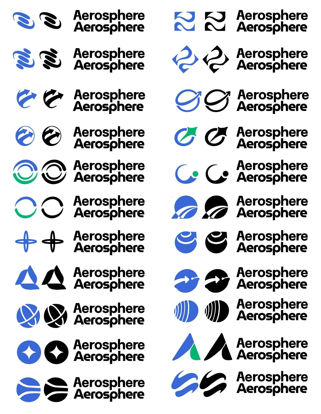
During the early stages of the Aerosphere rebrand, I focused heavily on the sketching process to explore how the new identity could visually represent clarity, expansion, and innovation. I began with loose concepts that translated abstract ideas—such as atmosphere, movement, and air quality—into simple, recognizable forms. These initial sketches allowed me to experiment freely with shapes and structure before refining the direction into something more cohesive.
From there, I evaluated which concepts felt the most adaptable and aligned with the brand’s forward-looking identity. I prioritized designs that could remain distinctive while staying clean and scalable across different applications. This exploratory phase helped shape the foundation of the final mark, ensuring that the identity felt intentional, modern, and flexible enough to grow alongside the Aerosphere name.
I explored several color palettes during the process, ultimately choosing to build upon the existing blue gradient. Rather than replacing it, I refined and expanded it by introducing more vibrancy and depth. This approach preserved the brand’s familiarity while giving it a more modern and energetic presence.
Sketching Process
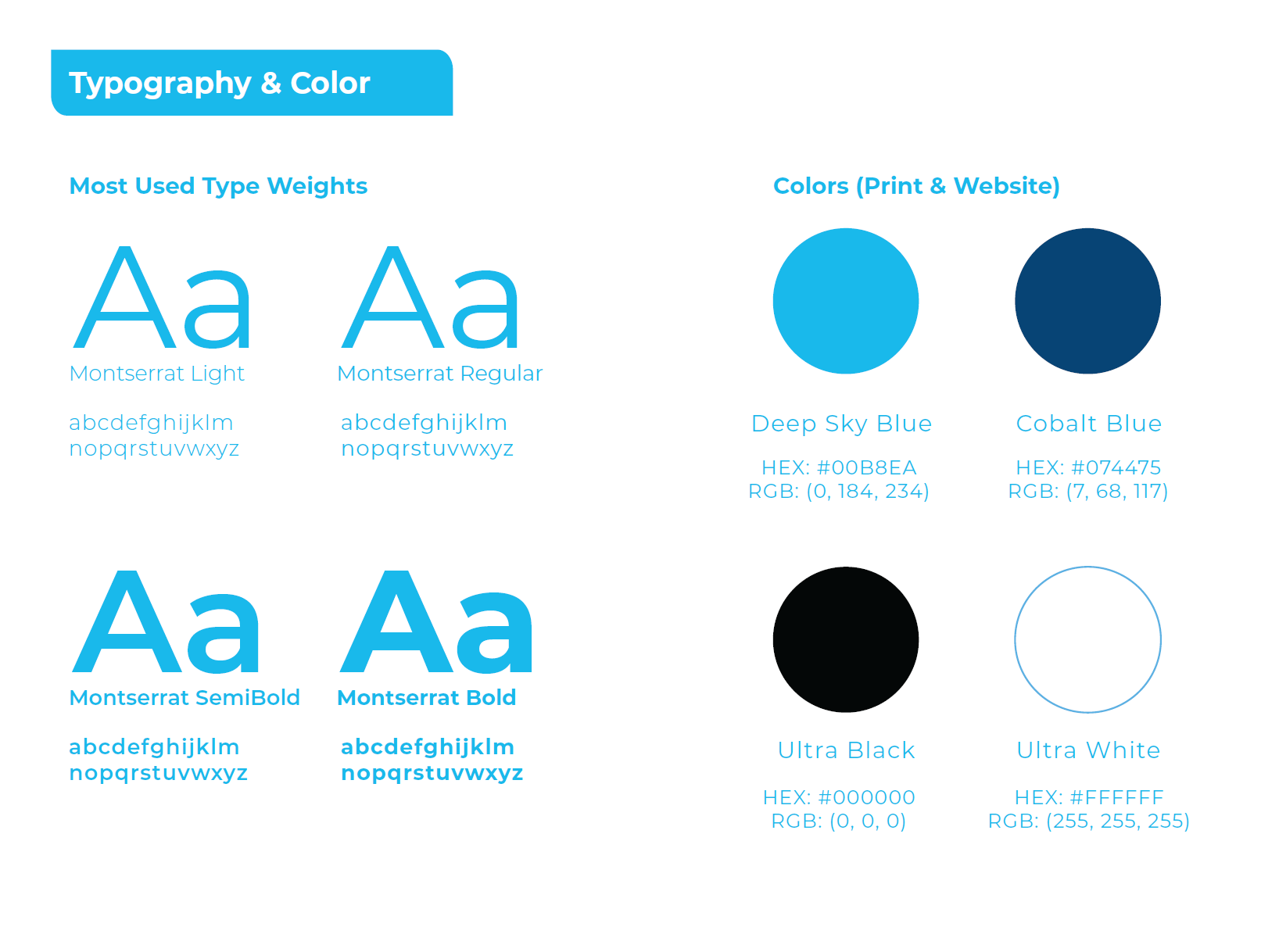
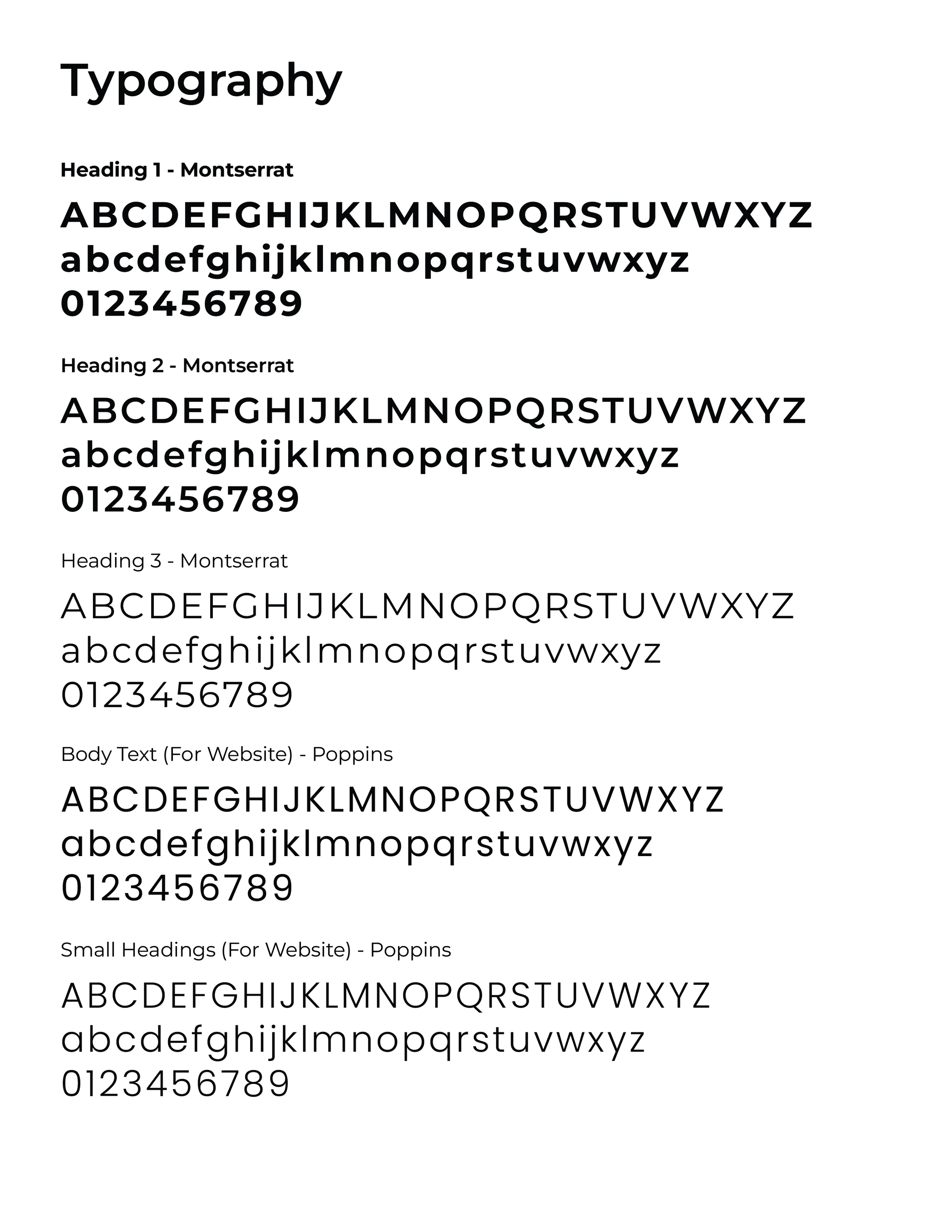
Typography
The primary logo typeface is New Order, customized to create a distinctive and ownable mark. A key request from the executive team was to integrate the brand icon into the letter “O,” creating a seamless and recognizable visual element within the logo.
For supporting typography, I selected a modern, clean sans-serif typeface that translates easily across commonly used internal software, from creating presentations on Google Slides and to . The goal was to ensure consistency and accessibility, allowing the brand to maintain a polished and professional appearance across both marketing and internal materials.
The current aerosphere website currently uses Poppins. This is another typeface we are currently using only for digital platforms.
Color Palette
The color palette was refined to feel modern, clean, and forward-thinking while maintaining professionalism within the B2B aerospace space. The updated tones introduce a refreshed look that enhances visual clarity and brand recognition, while remaining versatile enough to work across digital platforms, print materials, packaging, and sales collateral.
Typography & Color Palette
The goal was to recreate and refine the original swoosh while preserving its recognizable form. I developed a vectorized version of the existing mark, simplifying it into a cleaner, more two-dimensional shape and reducing the wispy details to create a stronger, more modern silhouette.
The most notable distinction between the original and updated swoosh is the introduction of a blue gradient that moves through the form. This subtle shift adds depth and motion while maintaining a polished, contemporary feel that aligns with the refreshed brand identity.
Swoosh Design Asset
Here is an example of the rebrand applied to product documentation. The updated identity was incorporated across layout, typography, color, and visual elements to ensure consistency and clarity. This application demonstrates how the new brand system translates seamlessly into technical materials while maintaining a modern, cohesive, and professional appearance.
Documents (Rebrand Incorporated)
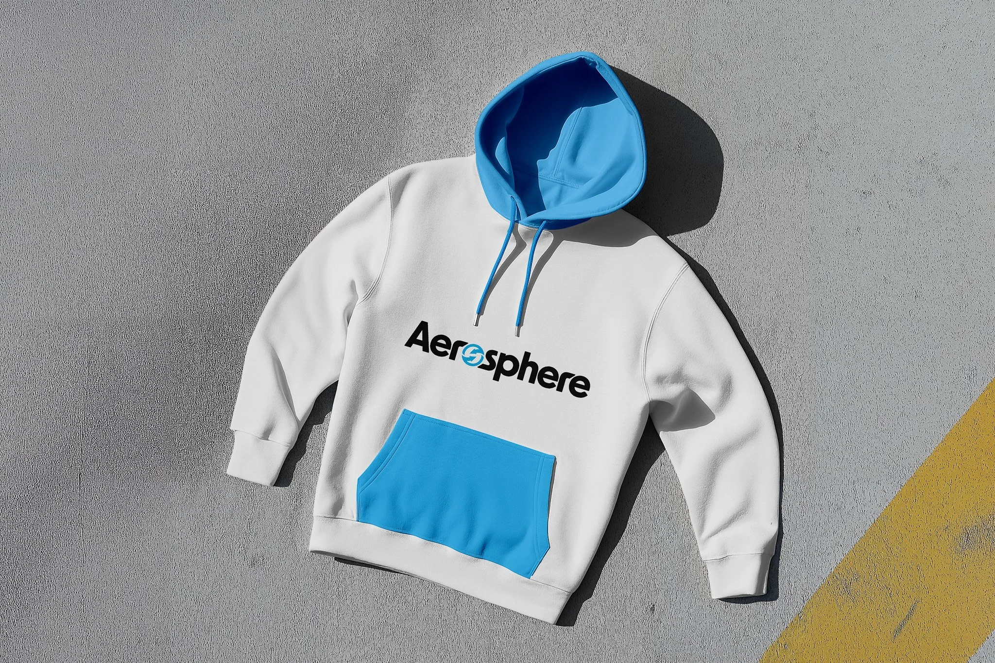
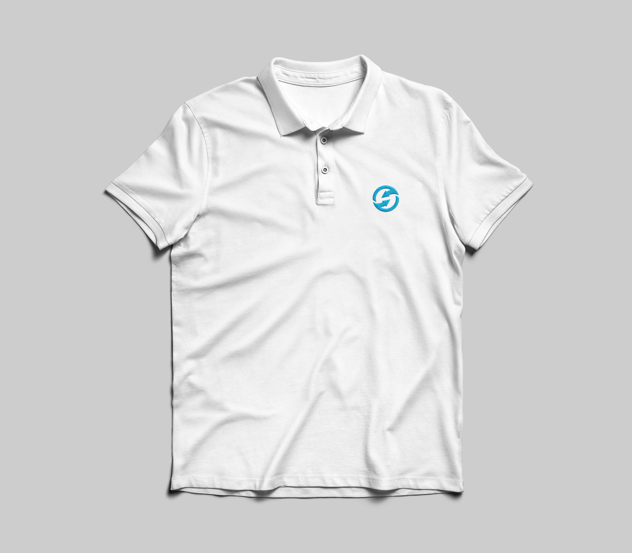
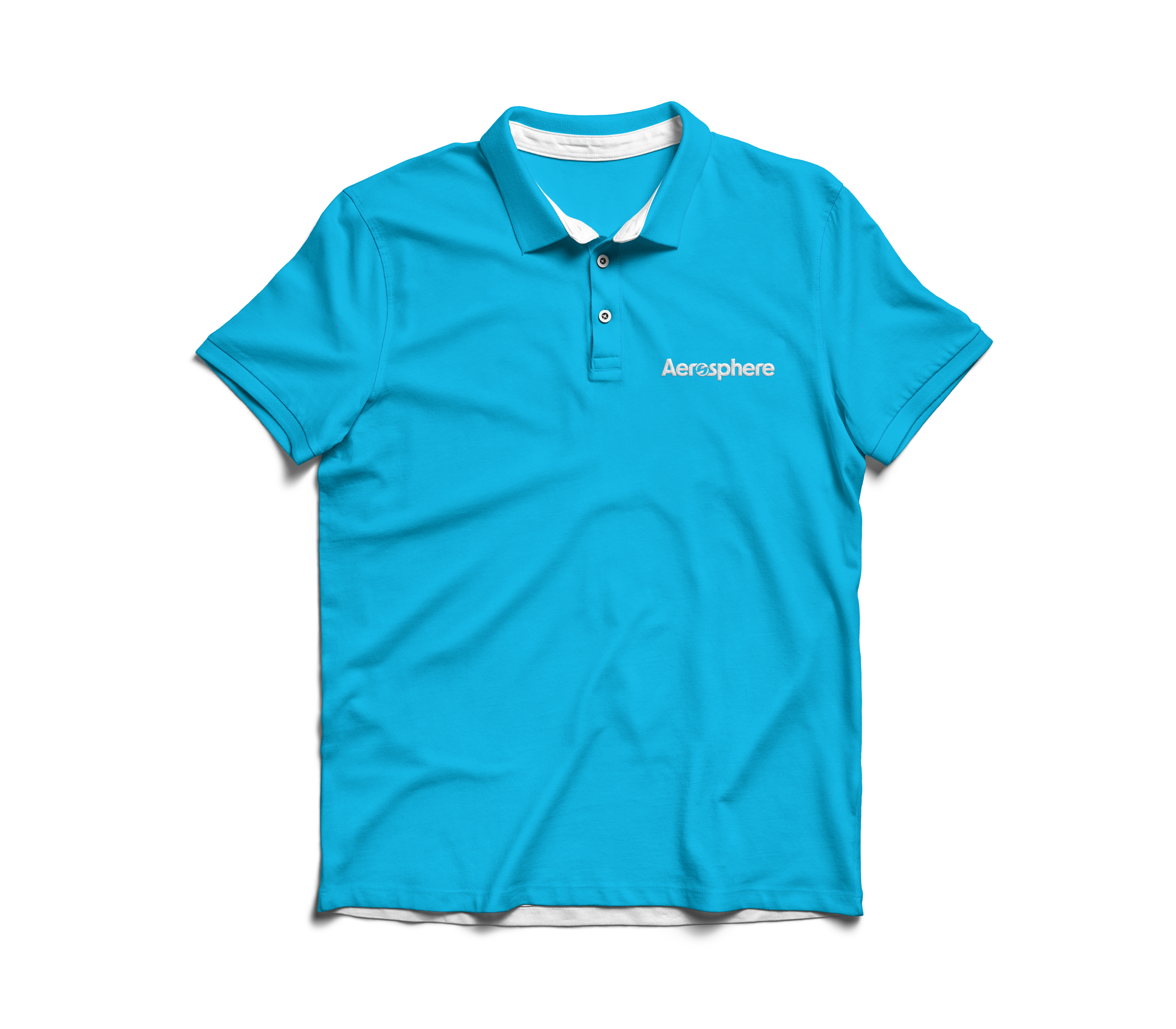
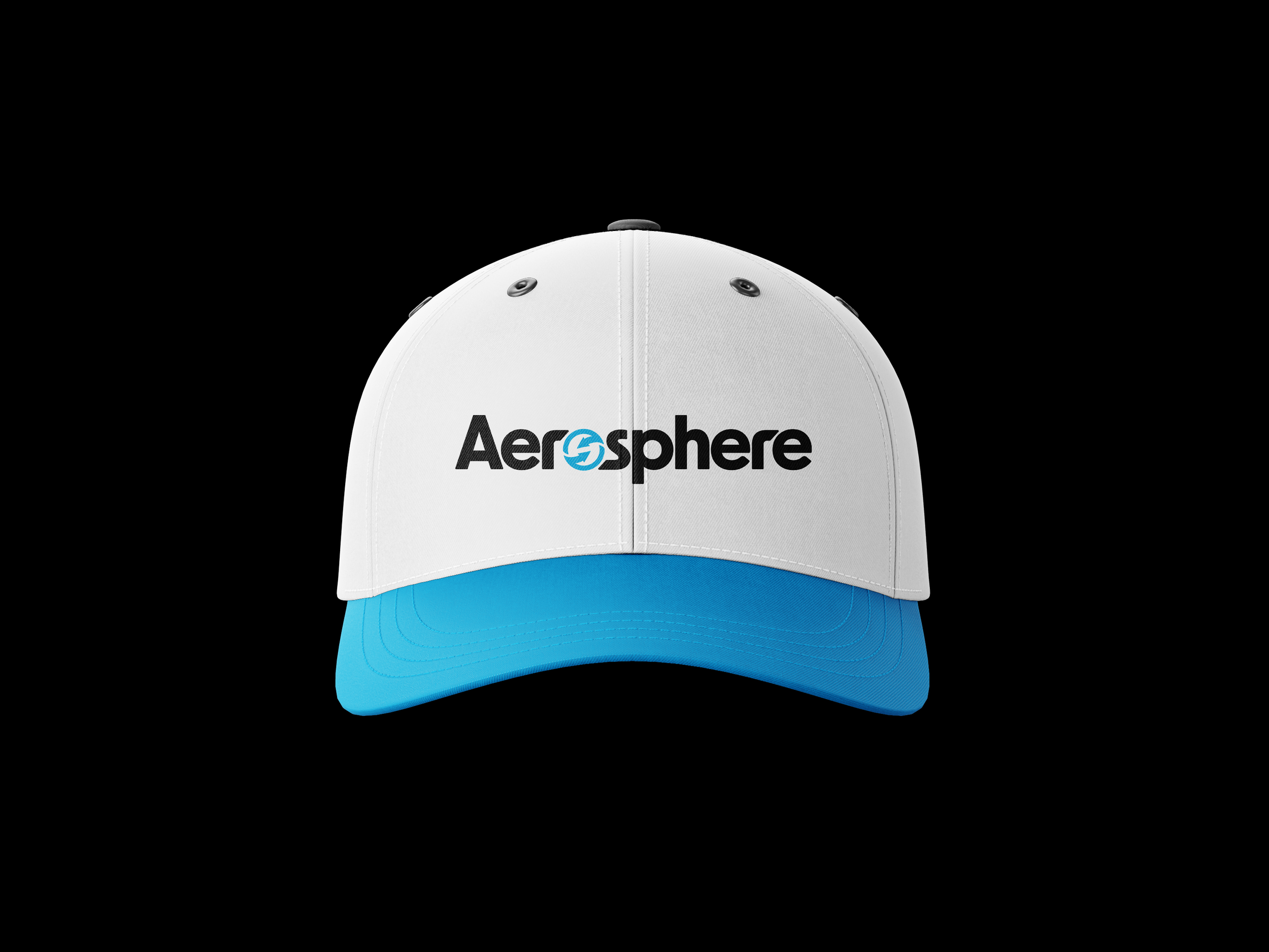
Company Apparel
Website
Visit aerospheremonitoring.com to explore the redesigned website and see the work in action!
For the website redesign, I approached the digital experience through a B2B lens, thinking strategically about how business owners and decision-makers navigate and evaluate a company online. The goal was to create a site that not only reflected the refreshed brand identity, but also functioned as a strong marketing and sales tool.
I refined the layout, improved navigation, and strengthened visual hierarchy to create a clearer, more intuitive user experience. SEO considerations were integrated to increase visibility and drive more targeted traffic, supporting both engagement and e-commerce growth.
The updated design elevated the overall credibility of the brand and created a more seamless, conversion-focused experience that aligned with Aerosphere®’s new era.
View Aerosphere’s Instagram and LinkedIn to see the latest work I help create and post!
Case Study Reflection
Leading the Aerosphere® rebrand was an incredibly rewarding experience. Over the course of a year, I had the opportunity to apply and refine the skills I’ve developed as a designer, translating an established identity into a modern, cohesive brand system.
This project challenged me to think strategically about consistency, scalability, and real-world application across multiple touchpoints—from digital platforms to technical documentation. Reimagining the brand while honoring its legacy strengthened my ability to balance innovation with brand recognition, and solidified my passion for building thoughtful, impactful design systems.